Blogg - Sida 4 av 6 - Webshopkonsulten
Improve Conversions on Your Social Media Ads With Landing Pages

Image by Markus Spiske
Landing pages are an inseparable part of the web browsing experience: we have all visited one at some point, whether or not we were conscious of the fact. Whenever you click on an online ad, register for a webinar, download a survey or a white paper, it’s likely that a landing page facilitated your experience. It’s not surprising, then, that these types of pages are an essential tool for a marketer, as they help move the potential lead down the sales funnel, converting a visitor into a customer.
What is a landing page?
In the realms of marketing and advertising, landing pages are the web pages which are accessible exclusively through a link or a button, and built to serve a specific objective. Social media landing pages, which we will focus on in this post, are commonly accessible by call-to-action buttons on paid social advertising, among other times of digital ads.
Elements of landing pages include a brief description of the offer, a call to action, and a preview of the product or service. In an ideal landing page, both the copy and the page design converge on a single purpose: to drive the customer to a specific action, such as downloading a white paper or registering for a webinar.
Almost as important as knowing the definition of a landing page is knowing what the landing page is not. A landing page should not just be the homepage of your website—there are too many buttons to click, options to choose from, and products and services offered. If the goal of your social ad is to increase traffic to your domain, consider other options and leave landing pages for what they do best—help acquire sales leads.
Why does my social media ad need a landing page?
It might seem like a lot of work: first, you have to toil away at your social media advertising strategy, and now it turns out that’s not enough? In fact, landing pages can help you support the customer experience in areas that ads often fall short: they provide more context for the value add of the initial offer, capture more information about your customers, and allow you to zero in on a specific product or offer.
Landing pages help businesses increase conversions on the social media ads by honing in on the juicy details of the offer. This helps make the ads more effective, since most of them are limited by character and image size on the host social network—the landing page helps elaborate more on the value of the initially advertised offer. It also segments the value proposition into several easy-to-understand parts: for example, your social ad may contain a call-to-action button that simply says “Learn more,” which takes the user to a landing page with an added offer of a free trial. However, it’s important to be consistent with your offers across the advertisements and landing pages, even if the offer is segmented into two or three parts.
Landing pages also provide a better social advertising user experience: a user who noticed your ad while browsing their Facebook News Feed will have a dozen distractions—friends’ updates, photos, birthday and event notifications, etc. By taking the user to a dedicated page, you are removing all the extra noise and helping them focus exclusively on your offer.
Another advantage of using landing pages for social media ads is their increased capacity to capture leads. Major social media networks offer ad analytics for businesses, which include the user’s location, gender, and age group. But capturing the specifics, such as their name, occupation, and email address is a different story. This is where landing pages come in: most of them include a lead capture form that encourages users to fill out their first and last names, email address, company they work for, and their job title. Not only does this help marketers get a better picture of their potential customers, but it also presents an opportunity to contact these customers with similar offers in the future. However, be careful about how much you ask of your customers—the general consensus among conversion experts is that the more information you ask to disclose, the lower your conversion rate will be.
9 tips on using landing pages for your social ads
There are many elements to a landing page, and the best way to find out what helps your business achieve the best conversion rates is to test, test and test. Keep this in mind when you consider implementing any of the following tips—these practices have been effective for other businesses, but your product or service may call for something completely different. Don’t be afraid to trust your instinct, but make sure it’s always backed by conversion data.
1. Keep your copy consistent across ads and landing pages
The last thing you want to do is mislead a potential customer with inconsistent offers. Since the landing page works best as an extension of your advertising, make sure the copy is consistent in both the ad and the landing page. For example, if you’re drawing people in with a 2-for-1 offer in the social media ad, your landing page should give more details on how the customer can get the 2 items for the price of 1.
2. Acknowledge the social media referral on the landing page
The way brands communicate with customers on social media is often different from any other communication line—there’s room to show off personality, have a sense of humour, and stray off the beaten path for different approaches to interaction. Thus, it’s advantageous for brands to address the referral source on the landing page, especially if you know the customer will be arriving there from a social network. This can be done by including the brand’s official Twitter handle or Facebook page in the body of the landing page copy, or simply open with a line that mentions the network. This is especially helpful for brands involved in social media marketing or e-commerce, since they know their customers will also likely to look for profit from social channels.
3. Place essential page elements above the fold
The central part of the landing page is the call to action button—whether you’re encouraging the customer to start a trial, download an asset, or sign up for a webinar, all the design and copy are designed with the single purpose of driving the user to click the button. In order to accomplish this, design your page to have all important elements “above the fold,” or in the portion of the page that is visible in a browser window when the page first loads. If you’re not sure if your landing page presents the information right away, look at the portion above the fold and ask the following questions, from a user’s perspective:
Where am I? What’s the purpose of this page?
Do I know what they’re offering?
Does this page explain what I have to do in order to get the offer?
The first question might seem a bit silly, but you’d be surprised at how many landing pages fail to identify their brand association. Whether it’s a logo, recognizable brand colours, or a headline that mentions your company, your ownership of the page should be explicit.
4. Don’t reuse copy for multiple ads or landing pages
Since landing pages are such an important part of the lead conversion process, your company needs to pay special attention to the text on the page—which can be a challenge if you don’t have a dedicated copywriter. Thankfully, there are plenty of online resources that can help you optimize copy for the purposes of your landing page. Plus, if done right, your word count for landing page copy shouldn’t be that high anyway.
The main thing to remember is to tailor each landing page to the value prop of social media ads that refer to it, as well as the offer. Don’t reuse copy from other landing pages, even if the chances of the same customers seeing the copy twice are low. Not only does it appear lazy, but it can also hurt your conversion rates, especially if the copy is inconsistent with the offer from the social media ad.
5. Focus your landing page on the value add for the customer
The purpose of landing pages is to gather more leads, but all elements of the page need to focus solely on how the offer can help the visitor, not your business. As such, it’s important to highlight the value of the asset or the offer every step of the way—whether it’s done by cleaning up the copy and removing any jargon-heavy parts, using more possessive pronouns, or including customer testimony. James Scherer of Wishpond advises marketers to “[h]ome in on what the visitor gets, not what they should do.”
For example, if you are designing a CTA button for an offer concerning a cleaning product, encourage customers to “Clean up my kitchen!” instead of “Buy now.”
6. Optimize your call to action button
The CTA button is the crown jewel of your landing page: it’s what the user will be looking for when they first arrive on the page, because it’s what gets them the asset or offer promised in the social media ad. So make sure your CTA button is clearly visible, ideally above the fold, and the copy is consistent with the offer. For example, if the purpose of the landing page is to get users to download a white paper, your CTA button copy should have a variation of “Download now” or “Read now.”
When it comes to the landing page’s CTA buttons, the testing rule is more important than anywhere else on the page. Test the colours of the button, the font of the letters, the actual call to action text, and directional cues around the button itself. You might be surprised what gets you that three-digit spike in conversions—sometimes, it’s something as little as changing a possessive pronoun!
7. Use trust badges
If the conditions of receiving an offer ask the user to disclose personal information, it’s important that the customer feels safe to do so. In landing page design, this means including trust badges and displaying them in a prominent spot. Ideally, you want these badges to be close to the call to action button, so the customer is reminded of your trustworthiness as a final motivation to consider your offer.
You can also mention your partners or clients that belong to an industry that may be similar to the visitor’s occupation (especially if you target your social advertising to a certain demographic), as a way to show off recommendations from professionals in that field.
Be aware of the design of these badges: you want to follow brand standards of security brands, as well as your clients and partners, but avoid piling in too many logos or conflicting colours. This might actually take away from the overall impression of your landing page, and that’s the opposite of the effect you want to achieve.
8. Optimize your design assets
In the same vein as the text on the landing page, all design assets should show off your offer in the best light without being too excessive. Follow a simple colour palette, don’t add too many images or videos, and don’t overdo it on the directional cues. With landing pages, less is more—try to include as little extra elements as possible, but make sure all of them contribute to the main purpose of the landing page.
9. Test, test, test
Remember that testing is the most effective strategy to increase conversion rates? Before you implement changes based on any of the tips above, run an A/B test to see if these factors actually influence conversion on your brand’s landing pages. At the very least, test two different versions of the landing page to see how the different changes affect your numbers. However, according to WordStream founder and CTO Larry Kim, if you want to break the top 10% of winning landing pages, the more pages you test, the better are your chances of drastically increasing conversion rates. Kim recommends testing ten (!) landing pages with different offers, messaging and flow to find the winning combination for your business. Designing landing pages is not for the faint of heart—but if it helps you gather more high-quality leads, these efforts will surely pay off.
Author of this article: Olsy Sorokina
Läs hur SIBA vände minus till plus med hjälp av E-handeln
SIBA har tillsammans med flera av sina branschkollegor haft några tuffa år på en hårt konkurrensutsatt marknad. Men nu har man vänt minus till plus. Något som beror på att man utvecklats från att ha varit en traditionell butikshandlare, till att bli ett välfungerande omnichannel-koncept.
Något som enligt SIBA beror på att man utvecklats från en traditionell butikshandlare, till ett väl fungerande omnichannel-koncept. Resultatet har under senaste räkenskapsåret förbättrats med 91,3 miljoner kronor. Från -62,7 miljoner till ett positivt resultat på 28,6 miljoner.
– Vi har under året kunnat påvisa ökad tillväxt på en närmast oförändrad svensk hemelektronikmarknad, detta trots färre butiker i koncernen än föregående år. Vi har även förbättrat vår rörelsemarginal och fortsatt vår effektivisering av vår kostnadsmassa. Enkelt uttryckt har vi lyckats sälja mer till fler på ett effektivare sätt, säger Susanne Ehnbåge, VD på SIBA.
Ny hemsida på gång
För några år sedan tog man enligt Susanne en rad viktiga beslut på Siba för att anpassa sig till dagens och framtidens handel.
Något som gick ut på att vara bra på både e-handel och fysisk handel och kunna kombinera dem efter kundens önskemål, samt erbjuda dem en sömlös integration genom alla mötesplatser där kunden vill nå SIBA. Ett arbete som man kommer att fortsätta med framöver.
– Vi kommer inom en snar framtid lansera en helt ny dynamisk hemsida för såväl privatkunder som företagskunder samt kommer att initiera en rad åtgärder för att stärka vår omnichannel-position ytterligare. Vi har en tydlig strategi och förmåga att nå alla våra målsättningar, säger Susanne Ehnbåge.
Prisas i Norge
Något Susanne också gärna lyfter fram är att SIBA jobbar för att kunna erbjuda låga priser, oavsett om kunden handlar i en butik eller på nätet. Ett koncept butikskedjan nyligen prisades för i Norge där man utsågs till Norges billigaste nätbutik 2014 av tekniksajten Tek.no.
Sedan 2012 erbjuder SIBA samma pris i sina butiker som på nätet, vilket fortfarande ska vara unikt bland Norges hemelektronikaktörer.
– Många norska hemelektronikföretag marknadsför sina låga priser, lägsta prisgaranti och pengar tillbaka om någon konkurrent är billigare. Dock förekommer ofta skillnader mellan pris på samma vara mellan butik och deras hemsida, vilket innebär att kunden själv måste uppmärksamma prisskillnaden för att få utnyttja ”lägsta pris garantin”. Att erbjuda samma låga pris och fina service oavsett om kunden väljer att besöka oss på Siba.no eller i någon av våra butiker är något som vi ser som en självklarhet och vet att våra kunder uppskattar, säger Victor Bengtsson, landschef SIBA Norge.
Jimmy Andersson – Redaktör – www.ehandel.se
Bring kör hela vägen fram till jul för E-handlarna
Bring meddelar nu att de satsar på hemleveranser under julen. Tillsammans med två kända nätbutiker ska det gå att e-handla sina juklappar i sista minuten med hemleverans. Något som ska förlänga årets julhandel på nätet.
Fraktleverantören Bring meddelar tillsammans med nätbutikerna Nelly och Stylepit att de förlänger årets julhandel på nätet.
Hemleverans till dörren skall nämligen erbjudas hos Nelly fram till den 23:e december i storstadsområden i Sverige, Norge och Danmark.
– Julen är en viktig och intensiv period i handeln. I år förväntas julhandeln via nätet att slå nya rekord, trots att den ofta tar slut flera dagar innan jul. Nu förlänger vi julhandeln på nätet, säger Mathias Parkhagen på Nelly.
Kunderna slipper trängas
Hemleveranserna som även sker på lördagar skall alltså förlänga årets näthandel och Sïmon Saneback, VD på Stylepit.se, tror att bekvämligheten kan vinna över många konsumenter.
– Köparna vill ha bekvämlighet när de handlar och vad kan vara enklare än att få paketen ända hem till dörren? Det är lika smidigt att handla på webben som i vanlig butik, men man slipper stressen och trängseln på utlämningsställena, säger Sïmon Saneback på Stylepit.se.
Är du sent ute med e-julhandlandet ska det alltså gå bra att shoppa nära inpå julafton både hos Stylepit och Nelly. Hos Nelly sker leveransen dagen efter och hos Stylepit ska 21:a december klockan 23:59 vara sista minuten att shoppa julklapparna. Förutsatt att du bor i Stockholm, Göteborg eller Malmö.
Danmark före Sverige
Handlar man på Nelly bör man kunna sitta med en glögg framför datorn under förmiddagen på söndagen den 22:a och i lugn och ro klicka hem diverse juklappsplagg. För att sedan få det hemlevererat under den 23:e december, senast runt klockan 21:00.
– I Danmark, där både Bring och StylePit är verksamma, har man kommit längre än i Sverige. Där är konsumenterna vana vid att få leveranser hem eller till sin arbetsplats. Det är givetvis en möjlighet för e-handelsföretag att utvecklas även på den svenska marknaden, säger Johan Holgersson, kommersiell chef Bring Parcels & Express.
Att fraktleverantörer vill förlänga julhandeln för e-handlarna är inte ett nytt tilltag. Förra året satsade Posten på lördagsutdelning och i år har Schenker meddelat att de kommer köra ut paket till ombuden i storstadsområdena på lördagen.
En förlängning av e-julen är dock alltid uppskattad och förhoppningsvis får vi se en ännu större uppslutning kring att få ut paketen nära inpå julafton nästa år.
Julius Gunnilstam – Chefredaktör
www.ehandel.se
Zalando klättrar uppåt på den tyska börsstegen

Nätmodehandlaren kommer i sommar att ta plats i det tyska MDAX-indexet, ett index för medelstora tyska bolag med hög börsomsättning.
Zalandos premiär på Frankfurtbörsen i höstas bjöd inte på något glädjerus, men efter att nätmodehandlaren under våren visat upp fina försäljningssiffror, har aktiekursen hängt med. Jämfört med noteringen i oktober har Zalandos aktie stigit med drygt 41 procent.
Nu står det klart att Zalando, med svenska investmentbolaget Kinnevik som delägare, kommer att inkluderas i det tyska MDAX-indexet från och med den 22 juni. Ett index för medelstora tyska bolag med hög börsomsättning.
Börsvärde på 7,3 miljarder euro
Zalando ingår för tillfället i småbolagsindexet SDAX och är där med sitt nuvarande börsvärde på 7,3 miljarder euro det klart största bolaget. I samband med detta kommer fordonsteknikbolaget Bertrandt, vars marknadsvärde är 1,2 miljarder euro, flyttas ner.
– Vi är extremt nöjda med att inkluderandet i MDAX har blivit verklighet så snart efter vår börsnotering. Att ta plats i indexet över Tysklands 50 viktigaste midcap-företag understryker framgången i vår verksamhet och intresset för aktien, säger Zalandos vd, Rubin Ritter.
Jimmy Andersson – Redaktör
WordPress.com köper upp världens mest populära E-handelsplattform
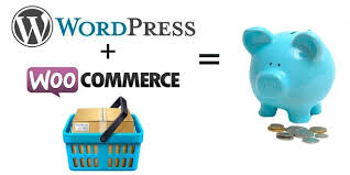
Företaget som driver WordPress.com, Automattic, lägger nu beslag på den omåttligt populära e-handelsmodulen WooCommerce och ska nu storsatsa på e-handeln.
Företaget Automattic som driver den populära publiceringsplattformen WordPress.com lägger nu beslag på WooThemes, företaget bakom e-handelsmodulen WooCommerce.
WooCommerce driver idag mellan 20-24 procent av Internets e-handel enligt analysföretagen BuiltWith och W3Tech. Magento har enligt senaste mätningen hos BuiltWith endast 7 procent av den globala marknaden.
I Sveriger ser det lite annorlunda ut men enligt Ehandelsindex är WooCommerce den tredje mest populära open source-plattformen. Den växer även snabbt och 100 nya e-handlare har hoppat på WooCommerce de senaste tre månaderna.
Det är förstås WordPress enorma popularitet som publiceringsplattform som hjälpt WooCommerce växa så pass snabbt. Folk är vana vid systemet och det ska vara relativt enkelt att slänga upp en butik med WooCommerce.
600 000 nätbutiker
Nu slår alltså Automattic och WooThemes sina kloka huvuden ihop och hoppas förstås på synergieffekter mellan publiceringssystemet och den mycket populära e-handelsmodulen.
– Under 2008, som tre främlingar i tre länder, satte vi ut på en resa att öppna vägen för kommersiella teman till WordPress, aldrig kunde vi drömma om den raketresa som den egendrivna e-handelslösningen skulle ta. Det har varit en otrolig resa, uppbackad av en unik gemenskap, och här befinner vi oss och driver över 24 procent av världens nätbutiker med vår huvudprodukt, skriver två av grundarna Mark Forrester och Magnus Jepson.
Den tredje grundaren Matt Mullenweg berättar mer om uppköpet, i nedanstående video, som nu skall leda Automattics satsning inom e-handeln. Redan idag ska 600 000 nätbutiker drivas via WordPress och WooCommerce.
Julius Gunnilstam – Chefredaktör
www.ehandel.se
5 Tips to Create an Irresistible Call to Action
When people land on your website, you want them to do something.
Sign up for your mailing list, share your content or purchase a product – something that progresses your goals.
But how do you get them to take the specific action you want them to?
Encouraging a prospective customer to take a desired action is one of the hardest tasks we have as marketers.
You need to focus less on beautiful design or amazing copy – and more on creating a powerful and compelling call to action.
A clear next step for your visitors, usually in the form of a clickable button.
So how do you create a compelling call to action?
Let’s take a look at some expert examples for inspiration.
Companies that have nailed their CTAs
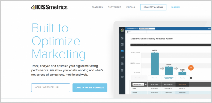
KISSmetrics: Their simple, yet persuasive, call to action – “Log In With Google” requires little effort and input from a visitor. It tells you precisely what to expect and is ridiculously easy to get started. By mentioning a respected name such as Google, KISSmetrics successfully pique a visitors’ curiosity and at the same time reinforces their need for security.
Evernote: “Want to remember everything? Sign up for Evernote” is another example of a compelling call to action. This time Evernote shows how simplicity can be the most effective way to persuade people. You immediately understand the message when you read it.
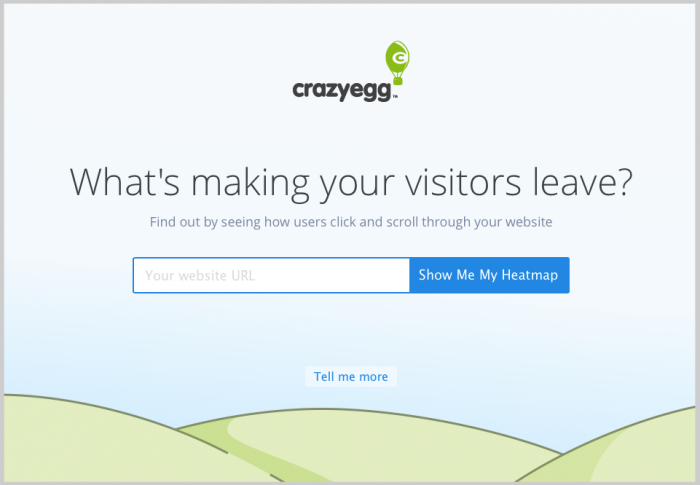
Crazy Egg: The “Show Me My Heatmap” call to action of Crazy Egg is both compelling and right on the money. It uses simple language and makes it further irresistible by utilizing the voice of the customer.
Square: Square’s call to action says “Get a Free Card Reader.” By offering something to their prospective customers, Square is successfully increasing conversions. This especially attracts small-business owners as the word “get” highly motivates them. Besides, prospects often find the word “free” genuinely surprising, which makes the CTA even more tempting.
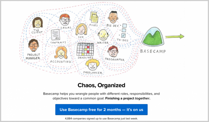
Basecamp: The minimalistic approach of Basecamp is reflected in its call to action – “Use Basecamp free for 2 months – it’s on us.” Basecamp uses the tried-and-true “free trial” approach with casually persuasive language. The company is simply asking users to try something, which is less intimidating. The secret behind its success is Basecamp’s relaxed attitude; after all, what’s the harm in trying something.
These are just a few examples of companies that have nailed their calls to action to enhance conversions. Others include Instagram, Pinterest, OKCupid, and GoToMeeting.
How to write a compelling call to action
Perhaps you have invested a lot of time and effort into your online marketing strategy, but aren’t seeing results.
Maybe you are getting traffic, but no conversions?
Your calls to action may be letting you down.
Here are 5 tips to create a compelling call to action for your website.
1. Be direct
Stop beating around the bush.
Your website means business and you should be direct in your approach. Be precise and tell your visitors what you do and what exactly you would like them to do.
The action must be simple, short and strong.
Make sure there is no room to play guessing games so your visitors aren’t clueless about what to do next.
Some examples of direct language include; ‘get started,’ ‘sign up,’ ‘submit,’ or ‘download’.
2. Be unique
As a marketer you already know that it is crucial to differentiate yourself from your competitors.
Find something that makes your call to action special; it could be ridiculously simple or something that aggravates a problem.
For example, Quick Sprout’s “I Want To…” call to action, plays on their prospective customers’ desire to solve a problem.
3. Use actionable language
Realize that some verbs and phrases are stronger than others.
Use action words that compel your visitors to do what you want them to.
“Call us today for a free sample,” for instance is a good call to action as it is actionable. You are giving clear direction to the reader using the verb “call”.
In contrast, something like “Give us a call for a free demo” is a less desirable call to action. Even though the verb “give” is actionable, it’s meaning is usually associated with handing a tangible object to someone, rather than making a phone call.
4. Be urgent
Your call to action should create urgency so that your visitors convert.
You can do this by conveying a message that your visitors are missing a great opportunity should they choose to do otherwise.
Convince them that the clock is ticking and delaying would result in missing the opportunity. Take examples from sites such as Amazon where they create a sense of urgency with calls to action like “Buy now to get 50% off.”
A well tested approach is to show an introductory price and mention clearly that the offer is available only for a short while and the price is likely to go up once that time is over. Using words like “today,” “now,” or “immediately” can work wonders here by adding a sense of urgency.
While “today” is a good word to add in your call to action, using “now” or “immediately” is even better. These words imply a greater urgency and also make it clear that the offer may not last forever.
5. Make it easy
The transition from call to action to performing the task must be seamless.
A complicated call to action is bound to fail. For example, if you want your prospective customers to call, provide your phone number.
Also, tell your prospects that converting is not timely or costly. If you are offering something free of charge, such as a free demo or a free sample, don’t forget to mention that in your call to action.
Similarly, if you want your visitors to sign up for your newsletter, make sure it does not take a long time to complete the process. There is a reason why most successful magazines and blogs, use calls to action like “sign up in less than 60 seconds.”
Wrapping it up
Creating a persuasive call to action takes creativity and time.
It needs to be simple enough so that users can easily understand your message and at the same time compelling enough to persuade them to do what you want them to do.
That being said, it is essential to remember that practice makes perfect.
Be experimental and see what works best for your audience.
Written by Vaibhav Kakkar for jeffbullas.com
Categories: Content Marketing, Conversion Optimisation Tips, Conversion Rate Optimization, Inbound Marketing
INTERNET USE TO DRIVE 1.4% INCREASE
INTERNET USE TO DRIVE 1.4% INCREASE IN MEDIA CONSUMPTION IN 2015
People around the world will spend more than eight hours a day consuming media this year. According to the Media Consumption Forecasts, a new report by ZenithOptimedia, people will spend an average of 492 minutes a day consuming media in 2015, up 1.4% from 485 minutes a day in 2014. This increase will be driven by the rapid growth in internet use, which will increase by 11.8%.
ZenithOptimedia’s Media Consumption Forecasts report surveys the changing patterns of media consumption in 65 countries across the world, and assesses how the amount of time people allocate to different media will change between 2014 and 2017. The report looks at the amount of time spent reading newspapers and magazines, watching television, listening to the radio, visiting the cinema, using the internet, and viewing outdoor advertising while out of the home.
Internet consumption to grow at 10% a year, expanding overall consumption
Global media consumption increased from an average of 461.8 minutes a day in 2010 to 485.3 minutes a day in 2014, an increase of 5.1%, or an average of 1.2% a year. Over these years, the amount of time people spent using the internet nearly doubled from an average of 59.6 to 109.5 minutes a day, while time allocated to more traditional media shrank from 402.2 to 375.8 minutes. Mobile technology in particular has created new opportunities to consume media, by allowing people to access the internet while out and about – shopping, commuting to work, waiting to meet friends, and so on.
We forecast that, between 2014 and 2017, the amount of time spent consuming media around the world will increase by an average 1.4% a year, reaching 506.0 minutes in 2017. Meanwhile, internet consumption will grow by 9.8% a year to reach 144.8 minutes a day. The internet’s share of overall media consumption will rise from 12.9% in 2010 and 22.6% in 2014 to 28.6% in 2017.
Traditional media losing out to competition from the internet
While the internet has propelled growth in overall media consumption, it has also eroded the consumption of traditional media. The consumption of every traditional medium except outdoor (i.e. newspapers, magazines, television, radio and cinema) fell between 2010 and 2014, directly because of competition from the internet, and we expect their decline to continue to 2017.
Newspapers have suffered the most from competition from the internet, followed by magazines. Between 2010 and 2014 the average time spent reading newspapers fell by 25.6%, while time spent reading magazines fell 19.0%. Television consumption fell by just 6.0%. Between 2014 and 2017 we expect newspaper consumption to shrink by an average of 4.7% a year, while magazines and TV shrink at average rates of 4.4% and 1.6% respectively. Note that these figures only refer to time spent with these media in their traditional forms – with printed publications and broadcast programmes watched on television sets. Any time that consumers spend with broadcasters’ and publishers’ online brand extensions is included in the internet total.
Exposure to outdoor advertising is rising
The amount of time people are exposed to outdoor advertising increased by 1.2% between 2010 and 2014, from 106.0 to 107.2 minutes a day. This is the result of several factors: more displays being built in public spaces, migration to cities in emerging markets, and consumers’ greater willingness to spend their leisure time out of the home as their disposable income recovered after the financial crisis. Between 2014 and 2017 we expect exposure to outdoor advertising to increase by 0.2% a year.
Television still dominates global media consumption
Despite its recent, relatively minor, decline, television remains by far the most popular of all media globally, attracting 183.9 minutes of consumption a day in 2014. Internet consumption came a distant second at 109.5 minutes a day. Television accounted for 42.4% of global media consumption in 2010, and 37.9% in 2014. We think it will still account for more than a third (34.7%) by 2017.
Latin Americans spend the most time with media, people in Asia Pacific the least
Media consumption is highest in Latin America, where people spent an average of 744 minutes consuming media in 2014, and lowest in Asia Pacific, where consumption averaged just 301 minutes that year. Time spent consuming media in Asia Pacific is growing well ahead of the global average, however, as economic development gives people access to more media, and more leisure time in which to consume them: media consumption expanded by 6.7% in 2014, and we forecast average annual growth of 2.9% to 2017.
“The average person already spends half their waking life consuming media,” said Jonathan Barnard, ZenithOptimedia’s Head of Forecasting. “But people around the world are clearly hungry for even more opportunities to discover information, enjoy entertainment and communicate with each other, and new technology is supplying these opportunities. Technology also enables brands to communicate with and learn from consumers in new ways. We expect media consumption to continue to grow for the foreseeable future, multiplying the opportunities for brands to develop relationships with consumers.”
Knifeo.com ny online specialbutik för köksknivar

I veckan lanserade det svenska bolaget Knifeo AB sin nya e-handelsbutik för köksknivar knifeo.com. Bolaget startades i 2015 och målsättningen är att bygga marknadens bästa specialbutik för köksknivar. Från sitt kontor och lager i vackra Varberg planerar bolaget att betjäna sina matintresserade kunder i Sverige, Danmark och Norge.
Knifeo AB grundades av Thomas Wigen Sjöbacken som har en lång erfarenhet från handeln i Norge och Sverige, och 15 års erfarenhet med försäljning av köksknivar.
”Genom dessa år såg jag hur köket mer och mer har förvandlats till epicentrum i hemmet. Rummet som i utgångspunkten designades för att förbereda och laga mat har långsamt förvandlats till en inspirerande plats som inte bara ger en måltid, men också en komplett upplevelse för familj och vänner. Köket är ett rum fylld med energi, dofter, konsistens och möten mellan människor. Köket är hjärtat i hemmet!” Thomas Wigen Sjöbacken
I centrum av denna köksglädje står matlagningen där kökskniven är det viktigaste verktyget. Man brukar säga att bra verktyg är halva jobbet och därför tycker Thomas att alla som gillar att laga mat skall ha proffsiga knivar hemma. Knifeo har ett spännande urval av köksknivar från kända europeiska och japanska knivtillverkare som är kända för sitt goda hantverk. I månaderna som kommer vill sortimentet gradvis utökas med mer spännande varumärken och erbjudanden.
”Köksknivar är en produkt där kundens preferenser och användning inte skiljer sig avsevärt om du använder den i Sverige, Tyskland, Spanien eller Grekland. Produkterna finns i alla hem, i alla länder. Knifeo har en långsiktig europeisk ambition med sin etablering. Vi bygger vårt bolag på en framtidstro som handlar om att en stor del av e-handelns tillväxt kommer att präglas av fler specialiserade och nischade aktörer. Vi vill vara en del av den utvecklingen under de kommande åren”, säger Thomas Wigen Sjöbacken.
Pitch Perfect: How to Turn a No Into a Yes
Important insights from skilled Social Media Consultant Ann Tran

Social media is not a one-night stand; it takes time to build and continually nurture this relationship.
I get so many pitches a day. Before you ask anyone to work with you, put yourself in their position. Why would you ask me to endorse your book, product or service when we literally just met via an email you blasted to a ton of people? Not very intimate and perhaps the relationship is moving too fast for me. So don’t be so shocked when I politely reject your proposal.
For those looking to pitch social influencers, here is how to turn a no into a yes.
Foster relationships
Before I can evaluate your work and give it a recommendation, we need to have some sort of relationship. It needs to be built naturally, not feel forced and work for both parties.
“Relationships determine the job offers you’ll get, the consulting contracts you’ll win, and the business opportunities you’ll be presented with,” says marketing strategist Dorie Clark in a recent article.
Make a connection
Is there a right way to do this? Yes, there is. Recently, Rebekka Radice reached out to me. I loved her thoughtful email so I made time to hop on a call with her. I asked her was there anything she wanted to discuss specifically, she said no — she just wanted to reach out to me since we have been virtual friends for years. That was a genuinely sweet concept.
By the end of our call, we ended up with an idea for a possible future project together just by getting to know each other.
Ensure both parties benefit from the collaboration
Just like in real life, fostering relationships is important on social media. Would you walk up to a stranger at a convention or seminar and ask them to promote your product? Think about taking a step back, find some common ground and see if there’s a basis for collaboration. It’s good manners to give people a chance to evaluate both you and your work before you ask them to put their name behind it.
For instance, I’m sent so many infographics every day via email. I admit, some are pretty cool, but so many kill any interest I may have had with their pitch.
But marketer Neil Patel did it right. He featured me on the website, Quick Sprout with a cool infographic that illustrated my Entrepreneurarticle. He wooed me by creating something that was useful to me and showing me he understood the importance of collaboration, rather than just wanting to use my influence to promote his product, skills or service. This makes me completely willing to share and promote this evergreen and useful article to my audience.
The win-win pitch
People, in general, are more likely to respond positively to a request when they realize that they will be properly compensated. And compensation doesn’t always mean money; it can just mean returning favors. Reciprocation is the key to a healthy relationship.
It is better to let their experience or their relationship with the product unfold on their own. If the relationship is not authentic, the share will not be credible. And if the share is not credible, nobody wins, and the relationship is likely to suffer.
Contributer – Ann Tran – Social Media Consultant
The Quick Guide to Conversion Rate Optimization for Ecommerce
Ecommerce Conversion rate optimization (CRO) is about detecting where your site isn’t converting well and running experiments to see if you can increase conversion.
It uses hypotheses, testing, analytics and user feedback to improve website conversions – which can be anything from turning a visitor into a subscriber… to making a sale… to upselling so you can increase average order value. As the team at Qualaroo puts it: Whatever it is you want your visitors to do, this action is what you are going to measure and what you are looking to optimize.
CRO means optimizing not just for a paid sale but for growth overall.
Here’s how thought leaders define CRO:
“Conversion optimization is about…understanding your customers better and helping them complete their tasks faster, simplifying everything.”
– Peep Laja, Conversion XL
“CRO is the science and art of getting more revenue-generating actions from the same number of visitors.”
– Chris Goward, Wider Funnel
“Conversion rate optimization in its simplest form is finding out why your website visitors aren’t converting into customers… and then fixing it.”
– Neil Patel, QuickSprout
CRO uses the principles of persuasion – along with data gleaned from your customers – to squeeze more cash out of your store…
…which makes CRO the best thing for ecommerce marketers since the days of easy SEO.
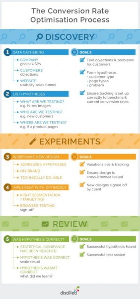
Here’s the CRO Process at a Glance
This is the beauty of CRO for ecommerce: with very little upfront cost, you can optimize your sales funnel to get more signups, upsells and referrals, creating a snowball effect with impressive, compounding results.
It’s the old marketing idea of squeezing everything you can out of what you’ve got. Rather than spending more and more to buy traffic, get more out of your existing traffic.
The CRO process generally works like this: learn about your prospects, and test creative based on what you’ve learned.
At Friendbuy, we’ve found that using the CRO process to test and implement a referral program can bring your Cost Per Acquisition to less than $10 for every customer (most of our clients hover around a CPA of $3).
Conversion experts like Quicksprout, Quarloo, Unbounce, Conversioner and Distilled all ascribe to the same CRO process, with little to no variation between them – which means that if you’re notdoing it this way, you should have a really solid reason why:
1. Collect data (quantitative and qualitative) from your ecommerce store and customers.
2. Gather insights from your research and create hypotheses to test that could increase conversions in your store.
3. Test your educated guesses to get objective results that you can use to improve your store.
4. Evaluate the results of your testing and implement them if your guesses prove correct.
5. Start the cycle again – as Karl and Ben at Conversion Rate Experts say, optimization never ends
To make sure you’re always following the steps the CRO pros do, bookmark and share this CRO process infographic courtesy of Distilled:
Although CRO doesn’t always mean split-testing, running tests (or experiments) is at the core of what makes CRO so appealing today. Technology makes it easier than ever for ecommerce marketers to make a change on a page and see if it’s good for business… or bad for business.
So let’s talk about the two primary types of tests you can run on your shop: A/B testing and multivariate testing.
Running Experiments:
A/B Testing vs Multivariate Testing
Here’s how Qualaroo distinguishes between A/B and multivariate (MVT) testing:
A/B or Split Testing
The testing of one version of a page or interface element against another version of the same thing.
Multivariate Testing (MVT)
The testing of multiple variations of many different page elements in various combinations to determine the best performing elements and combinations.
With A/B testing, you have two variations of a page or element that you’re going to pit against each other to see which converts better:
Variation A, also known as the Control
Variation B
(You can test as many variations as you’d like. Let’s keep it simple at 2 variations.)
Here’s what that might look like:

A/B testing image by Wordstream
In most cases, 50% of traffic will be sent to each variation. However, if you’re going to test something particularly risky, you may wish to expose that risky variation to a smaller percentage of your traffic, like 25%.
“Multivariate” testing (MVT) might sound like you need a math degree to figure it out, but it’s not as complex as it sounds. Optimizely compares it to A/B testing for us like so:
Multivariate testing uses the same core mechanism as A/B testing, but compares a higher number of variables, and reveals more information about how these variables interact with one another.
And here’s the graphic they share to help us visualize what that really means:
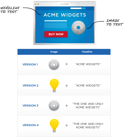
So instead of testing two different headlines like you would in an A/B test, MVTs combine a host of variables at the same time.
They’re especially useful when testing multiple elements (images, copy, calls to action).
For ecommerce shops, you may wish to test multiple elements of a product page at once.Perhaps you’d like to add a free shipping message, try a different headline and suppress reviews for products that have none. Rather than testing one new variation of the page with those 3 changes made to it, you could run an MVT and let your testing platform serve up different combos of the various elements.
In the end, you discover which combinations performed best, and you make those part of your new control.
But before we can choose which type of experiment makes the most sense for a test, we need to go waaaaay back to the data. That’s where every good test starts.
Where to Find Ecommerce Conversion Rate Data? It’s Probably Right Under Your Nose
The first step in the ecommerce CRO process is gathering the information you need to make educated guesses about where you can improve your site. This can be done with data fromGoogle Analytics, onsite customer surveys, or (gasp!) actually talking to your customers in real life.
For example, Gardener’s Supply Company realized from their analytics they were getting plenty of traffic from their Pinterest page.
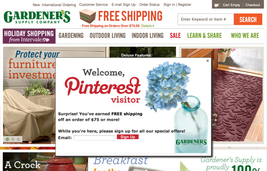
So to welcome their traffic from Pinterest they created a popup message and special offer for them (does Cialdini’s reciprocity principle ring a bell?), which ended up increasing their revenue 3xfrom visitors that came from Pinterest.
You can even get demographic info from Google Analytics to see who exactly is clicking to your site and what their interests are to find opportunities for optimization.
And if you use heatmapping tools like Crazy Egg, you can see what people from certain referral sources are clicking on most:
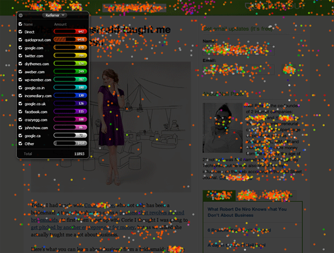
You can then use that data to drive new tests – and even personalization (a topic we won’t cover here, but one to stay aware of) – that are exposed only to visitors from selected referral sources.
Survey Says? The Customer Is Always Right
To get qualitative data, you have to get your Family Feud on and get feedback from your customers via surveys.
Qualitative data can help you with finding:
Where your customers are getting caught in your sales funnel
Great customer testimonials
The exact language to use in your landing page copy (just swipe it from your customers, as Joanna Wiebe of Copy Hackers recommends)
When you do customer surveys, make sure to use some of the following questions that CRO experts like Neil Patel, Peep Laja and Joanna use to gather priceless info from their customers:
- Where did you find us?
- What persuaded you to purchase with us?
- What other options did you consider?
- What’s one thing that nearly stopped you from buying with us?
- What was your biggest frustration, challenge or problem in finding our product online?
- How would you describe our product/service to a colleague or friend?
- How could we do a better job of persuading your friends or colleagues to choose our product?
- How would you persuade more people to choose our product?
- What questions did you have about about our business?
- What are you hoping to accomplish with our product?
- When did you realize you needed a product like ours?
- What was going on in your world that caused you to come looking for our product?
- What problem would you say our product lessens for you?
- What two words would you use to describe our product?
- What was going on in your life that brought you to us today?
It’s important to keep your survey questions open ended.
Why?
After all, isn’t that more work for everyone?
Yes, it is – but reading your visitors’ and customers’ words will give you incredible insights into the messages they need to see… messages worth testing.
To reduce the amount of friction that open-ended questions can introduce for your readers, Neil Patel from QuickSprout says not to include too many questions in your survey:
“Customers tend to get annoyed by longer surveys, and everyone’s time is valuable. If you present customers with a shorter survey, there’s a greater likelihood that people will fill it out, which means you’ll receive more responses to evaluate.” – Neil Patel, QuickSprout
Think about the information you need first… and then only ask questions that will give you exactly that.
Go Beyond Surveys
With Qualaroo, you can add non-intrusive surveys on your site to get really pointed, targeted feedback on whatever you’re wondering about.
For example, let’s say the data has shown you that a lot of people are visiting X Product page but conversion for that product is low; if you’re not sure what’s getting in the way for visitors, add a Qualaroo survey to that exact page – so it only pops for visitors on that page – and ask them the question you most want answered: “What 1 thing is keeping you from purchasing this product today?” Listen to what visitors tell you. And use that voice-of-customer data as the basis for an hypothesis for a split-test on that page.
You’ve surely already interacted with a Qualaroo survey, which pops up at the bottom of your page (usually) and looks like this:
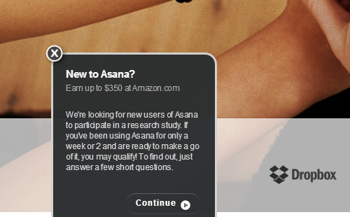
You can also get your users’ thoughts about your site in real time with UserTesting.
UserTesting records videos of real people while they’re using your site giving feedback as they are going through your sales funnel. With UserTesting you can:
Get real-time feedback as visitors are using your site (sure beats looking over a stranger’s shoulder).
Establish where bottlenecks are in your funnel and why users are abandoning their carts.
Find dead links and gaps in your site navigation.
Here are some great questions from Neil Patel that you can use to ask your site visitors:
- Is there anything you can’t find on this page?
- Is there anything confusing about this page?
- Do you have any questions at this point?
- What’s your biggest concern about purchasing [insert product name here]?
- What’s the number one reason that’s stopping you from making a purchase?
- What else would you like to see on this page?
- What can we help you find?
- Why didn’t you complete your purchase today?
- What could we have done to convince you to complete the purchase?
- What’s the biggest problem we can help you solve?
- What are you looking for in your ideal solution?
- What else can we place on this page to convince you to buy?
UserTesting now also offers a service called Peek, which lets you ask visitors on your site if they’ll leave recorded feedback. This is a big improvement to the User Testing service, which previously did not let you get tests from actual users of your site. Though new, Peek is being optimized regularly as a solution – so give it a shot.
If you think user testing is just for UX, it’s also hugely valuable for CRO. (Because UX is a big part of whether people convert or not.)
For example, think of the pages on your site that suffer from high bounce or exit rates. Wouldn’t you like to know what’s going on in the minds of your site users when they leave those pages in particular?
Headsets.com saw in their analytics that they had unusually high bounce rates on some of their secondary pages. But they couldn’t figure out why.
After telling visitors to simply buy a headset with UserTesting, Headsets.com found most of their customers were misdirected by their site navigation because they didn’t know what headset technology fit their needs.
So they set up an A/B test with new navigation that first asked their visitors to decide what type of phone they wanted to plug their headset in to, keeping the old navigation as a control.
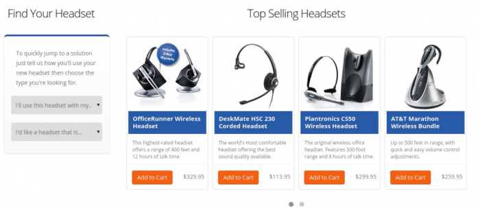
Their new navigation solved the navigation issue and increased their conversion rate by 10%.
This is a great example of why you shouldn’t stop short after gathering analytics data. Using a combination of quantitative and qualitative data will give you the clearest view of what’s not working in your sales funnel and lead you to ask the right questions when it comes to testing your hypotheses.
Yes, You Need a Hypothesis. Your experiment hypothesis is an assumption you’re making about what’s gone wrong and what might set things right.
If it’s easier – which I sometimes find it to be – you can ask a research question instead of coming up with a hypothesis. With a research question, you’re really putting into specific words (which makes it easier to measure success) what it is that you think may impact change:
Will adding testimonials to our catalog page help visitors feel that they are not the first to trust us and, thus, increase click-through rates to product pages?
Here’s an interesting way to go about getting to an hypothesis…
Ecommerce retailer ModCloth is a big believer in community and developed it through their selection of vintage and indie women’s clothing and inspired blog. They have a feature on their site that allows their tight-knit community of vintage clothing lovers to vote on what products they think Modcloth ought to sell.
After voting, they award the winning styles with a “Be The Buyer” badge. Badges are a powerful symbol of social proof, which is defined by Cialdini simply as people doing what they see other people doing. Since the ModCloth community is influenced by what the others in the tribe like, ModCloth capitalized on the wisdom of their crowd as the styles that carry the “Be The Buyer” badge sell at double the rate of styles without one.
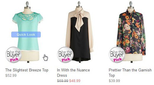
In this case, ModCloth might hypothesize that, given the tight knit ModCloth community, good prospects will be more likely to buy when they feel they are doing something in keeping with the goals of the community. This would make for a great test for them – and also for you.
As you can see, when we’re trying to increase conversion, we have to get creative. That doesn’t mean clever. That means smart + innovative. Persuasive. We need to tap into deeper motivations to get our prospects to act.
One common persuasion principle that ecommerce sites use to optimize their product pages is scarcity. Another principle championed by Cialdini, scarcity helps create a sense of FOMO (Fear of Missing Out) and creates an urgency to buy with visitors.
Amazon uses scarcity on their product pages. Orbitz does, too: when selling their flights, they let browsers know exactly how many seats they have left on their discounted flights.
Now let’s see how this thinking plays out in a test.
Monetate ran a test involving time-based scarcity (or urgency) on product pages.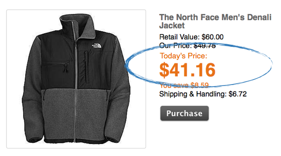
The tested variation added a countdown and urgency messaging near the call to action.
This optimization tactic resulted in an average order increase of 0.07% that while seems small, actually generated a million dollars in revenue for their ecommerce store.
Importantly, Monetate placed the urgency-inspiring elements near the call to action. Joanna Wiebe of Copy Hackers calls this adding “click triggers.” Click triggers help boost conversions by delighting prospective customers, helping them rise above any objections or fears they have about making a purchase – right at the point of clicking.
Click triggers can include conversion boosters like:
A testimonial, review, or tweet
A data point
Star ratings
Low-price messaging
Guarantees
Free or two-way shipping messaging
Payment-option messaging and/or icons
Security messaging and/or icons
Privacy messaging
Risk-minimizing messaging (e.g., a snippet about what happens after clicking)
Your value proposition
Joanna ran a click trigger test on our very own site.
Back in the day our call to action was a simple green button with no click triggers:
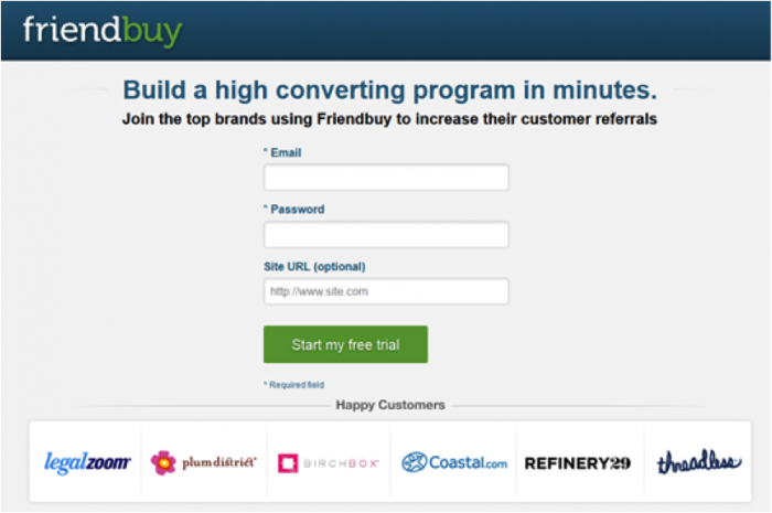
She came up with to variations to test against our control. Variation B used a testimonial, which added social proof to our offering:

Variation C used two objection-reducing bullets, which adds reciprocity:

The result?
Variation C beat our control call-to-action button by 34% with 99% confidence. That means we now see 134 signups for every 100 we used to get simply by adding two short lines of copy next to our call-to-action.
Now, of course, we’re not in ecommerce. But that doesn’t mean click triggers won’t work for you! It’s a great starting point for a test hypothesis / research question.
NatureBox, a healthy snack company, recognized that Super Bowl Sunday is probably the snack-iest day of the year in the US, so they changed their referral box copy to try and capture some of the 114 million people that watched the Super Bowl.
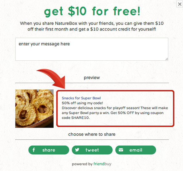
Notice the headline, “Snacks for Super Bowl.”
When their customers choose to share their purchase, this is the message that millions of people see while they’re checking their social media feeds and email during the game.
It turns out NatureBox scored big and created lift in referral visits, proving that you can capitalize on events and change your marketing messages to increase conversions.
Review Your Results, Implement Them… and Start the CRO Cycle Again
Optimization never stops. Even if you had 100% of your visitors opt into your list or convert into paying customers, you would still have opportunities to run experiments in your email drip campaign, your sales emails, your PPC ads, your retargeting ads – everywhere.
Everything can and should be optimized.
Testing on your site is just the lowest hanging fruit for so many ecommerce businesses.
The different ways you can test your site are almost limitless. Take for example a referral widget.
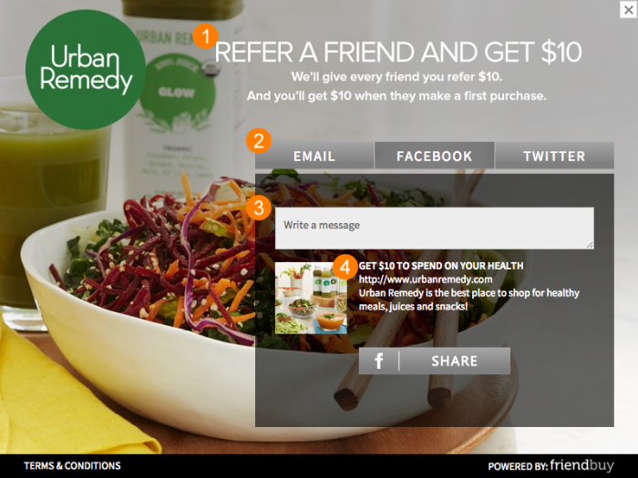
You can go through the CRO loop with multiple variations, optimizing your:
Call to action (what incentive drives sharing)
Unique messaging on a channel by channel basis (email, Twitter and Facebook will all have different text copy and images)
Nudge you give your customers to write their own personal message
Marketing message that you want your customers to share (what offers drive their friends to visit your site and convert)
Now, if you didn’t see any change in results for a variant, fret not! All this means is that you learned something new about your site, and because you tested a hypothesis instead of making a random change to your site with your gut, you didn’t do any harm! Move on to your next testing idea and try again…
Get Inspired! Here Are Some Powerful Studies to Get You stoked About CRO
Walmart Canada Sees 98% More Mobile Orders
When retail behemoth Walmart Canada saw that more and more of their ecommerce traffic was coming from tablet devices, they realized their current ecommerce site wasn’t set up for mobile conversions and looked to fix it.
Linda Bustos from GetElastic showed how Walmart used CRO to completely revamp their ecommerce site.
Walmart had a hunch that the site experience for mobile users was subpar at best. They knew that their site took way too long to load on mobile devices.
So they used usability testing (watching actual site visitors use their site) and A/B tested different site elements – from banners to copy to images – to come up with a new mobile responsive design:
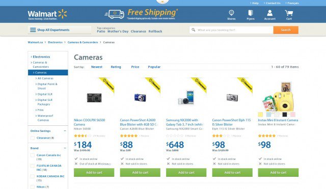
Walmart knew they they needed to make it as easy as possible for their core customers — moms — to shop from anywhere with their phone or iPad.
So they developed a responsive grid design to make it easy for touch-centric sales:
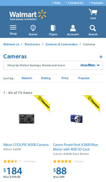
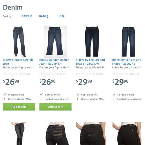
With the responsive redesign of their site, Walmart was able to increase conversions by 20% on all devices. Even more astounding, mobile orders increased by 98%.
This is CRO at its core.
It’s all about measurable growth.
Walmart was one of the first enterprise-level ecommerce retailers to embrace CRO principles and they reaped some crazy benefits while becoming an industry leader in ecommerce sales.
Vancouver Olympics Sees 21.8% More Sales
Take a look at another big CRO win from GetElastic.
GetElastic was tasked with improving conversions for the Official Vancouver Olympics ecommerce store . . . no small feat.
One of the first things they noticed when using the site was the store had a unnecessarily long two page checkout process:
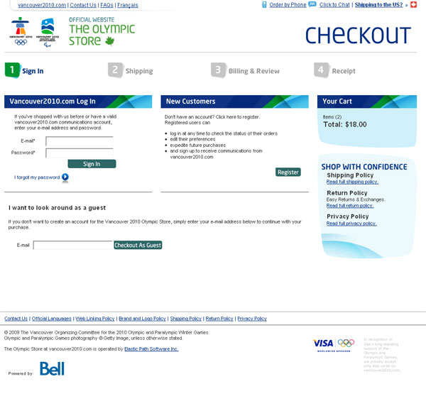
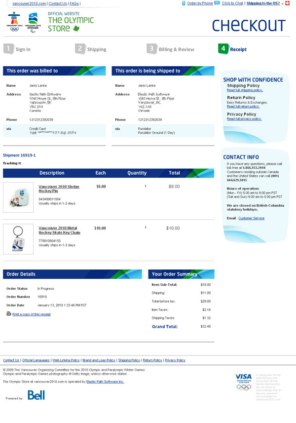
Putting up additional roadblocks between your customer and a sale is never good, so they set out to fix this by switching to a new one page checkout process:
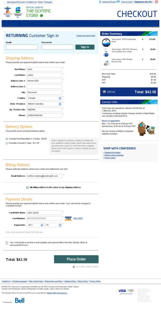
See how everything a Winter Olympics fanatic needed to fill out was right in front of them on one page?
The store even put the dreaded “create an account” box after the sale to reduce another barrier to purchase:
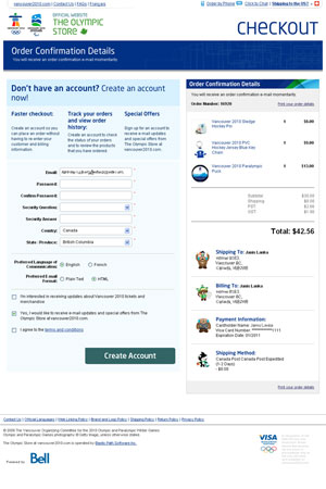
GetElastic split test both the single-page and two-page checkout processes.
The single-page checkout increased paid conversions by 21.8%!
Ecommerce Retailer Sees $300 Million Lift
Would you believe me if I told you one of these buttons was worth $300 million more than the other?

It’s true. According to Jared Spool, by simply changing the Register button to Continue for an ecommerce retailer, he was able to to increase their conversion rate by 45% and extra purchases that resulted in an extra $15 million in the first month.

An additional message was added under the Continue button. It read:
“You do not need to create an account to make purchases on our site. Simply click Continue to proceed to checkout. To make your future purchases even faster, you can create an account during checkout.”
In the first year, the large ecommerce site saw an additional $300 million in revenue. There are small changes like this you can test all over your site to increase revenue – don’t hesitate to start digging for clues in the first phase of your CRO process.
Online Florist Gets 44% Lift in Sales
After their research found that new visitors of the South American flower delivery shop daFlores often had never heard of the company, Conversion Rate Experts replaced a rotating banner that showed customer testimonials with a static image that read, “Thanks to our 600,000+ Facebook fans” in Spanish.

By simply adding a different kind of social proof to their landing page, daFlores nearly doubled their revenue:

By emphasizing the fact that over 600,000 liked them on Facebook they were able to impress their new visitors who may not have heard of them. That one simple change caused a 44% lift in paid conversions for the online florist.
Online Hardware Store Sees 11.9% Lift
Taloon.com, a Finnish based hardware ecommerce store wanted to increase conversions on their product pages and started doing some A/B tests to find a way in improve sales.
Even though studies show that 89% of online shoppers used at least one social network, Taloon decided to go against the grain and remove social sharing buttons from their product pages:
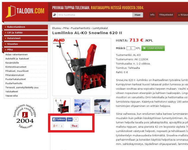
As you can see, the social sharing buttons shares were at zero, defeating the purpose of having them there in the first place! If anything, visitors were less trusting of the store because no one was sharing their products.
The below image is their product page without the social sharing buttons:
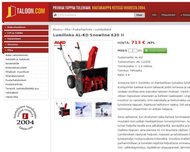
By simply removing the social sharing buttons, conversions on Taloon’s product pages increased by 11.9!
This goes to show that just because everyone is using a tactic, it doesn’t mean you should follow. Every store is different and you have to go through the CRO process we described above to find out what works for you. Who knows, maybe pulling elements from your site will result in increased conversions like Taloon.
Not Just Testing: More Ways to Optimize Conversions and AOV
For ecommerce sites, “conversions” are generally paid conversions, and you’re most likely to measure the success of your copy, design and experience on whether you got more sales and/or higher average order values.
That said, ecommerce sites are increasingly trying to capture leads for email marketing and social marketing purposes. There are huge optimization opportunities in lead capturing and nurturing. If you’re investing in CRO, you should also be investing in widening your funnel with more leads and turning those leads into paying customers via split-test emails.
Take a look at what ModCloth does:
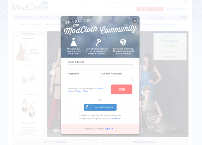
Think of all your visitors. Now think of your conversion rate. Now think of how you could increase your conversion rate by getting contact information from another 10 or 20% of your visitors – think of the marketing opportunities! That’s growth hacking, and that’s a big part of CRO.
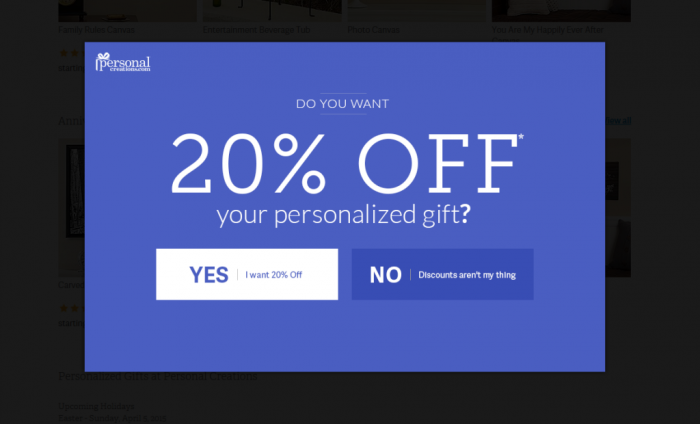
You can also keep people from leaving your site by offering them coupon codes via pop-ups. Personal Creations does just that:
As you can see, CRO isn’t just about split-testing elements on your page.
It’s about doing more to get more out of every visitor who arrives on your site.
We’d love to hear about any big CRO wins you’ve had with your ecommerce site or if you’ve been inspired with any new testing ideas in the comments…

About the Author of this article: Tony Mariotti:
Tony Mariotti is COO at Friendbuy, the marketing platform that makes it really easy to launch a customer referral program. A/B test and optimize your refer-a-friend campaigns without developer headaches.


